KERA
Interview with Berlin based artist KERA:
What drives me are the projects outside. Creating something with my hands and being physically active. The exchange and influences of different cities, countries and also cultures. Getting to know different people and their way of life. All these energies and color worlds I let flow into my work.
Looking at your work, the style and visual language imply your artistic background: for over 20 years you have been working with colors, printing techniques, and façade painting, and your work combines abstract structures and graphic forms in balanced compositions that are a reflection of your graphic design studies, but nevertheless remind us of graffiti and stencil because of their often horizontal, dynamic forms. How did you get into (urban) art? Was it the path from graffiti to graphic design, or the decision to express graphics not only in design, but also in public spaces?
My roots clearly come from graffiti. In 1999 I started to work with colors, spray cans, and letters. For the first ten years I did nothing but spray letters.
My interest in and passion for abstract graphic forms came later through intensive contact with screen printing and printing techniques in general, with which I was engaged for years. Also, my training as a graphic designer was a great artistic development impulse for me.
Developing shapes and lines with the computer and then transferring them to the wall by hand still excites me. I learned that I can quickly change and shape my sketches on the computer, but that “standing at the wall” and creating something with my hands is the most important and exciting part for me.
What fascinates you about abstraction? Where does your great passion for geometric lines and spatial and graphic structures come from?
I have been unconsciously occupied with structures and haptics for more than 20 years. I have worked on so many different surfaces that have contributed to my passion. Also, not just seeing a piece of art, but feeling it, opened up a new level for me. I think many know the feeling in a museum of wanting to touch the painting so badly; you want to feel it.
With figurative painting, I quickly realized that it doesn’t excite me to draw something very precisely. A vase always remains a vase. Only when I started to draw the vase blindly did it become exciting for me. The new elements and shapes that came out I found fascinating. How free it suddenly became.
My sense of order and my background as a graphic designer did the rest. After I got bored with letters, since there was no further development, I realized it was time for something new. But what? So I started to deal with the pure line and surfaces. So I came piece by piece to where I am now stylistically.
What stories do your works tell?
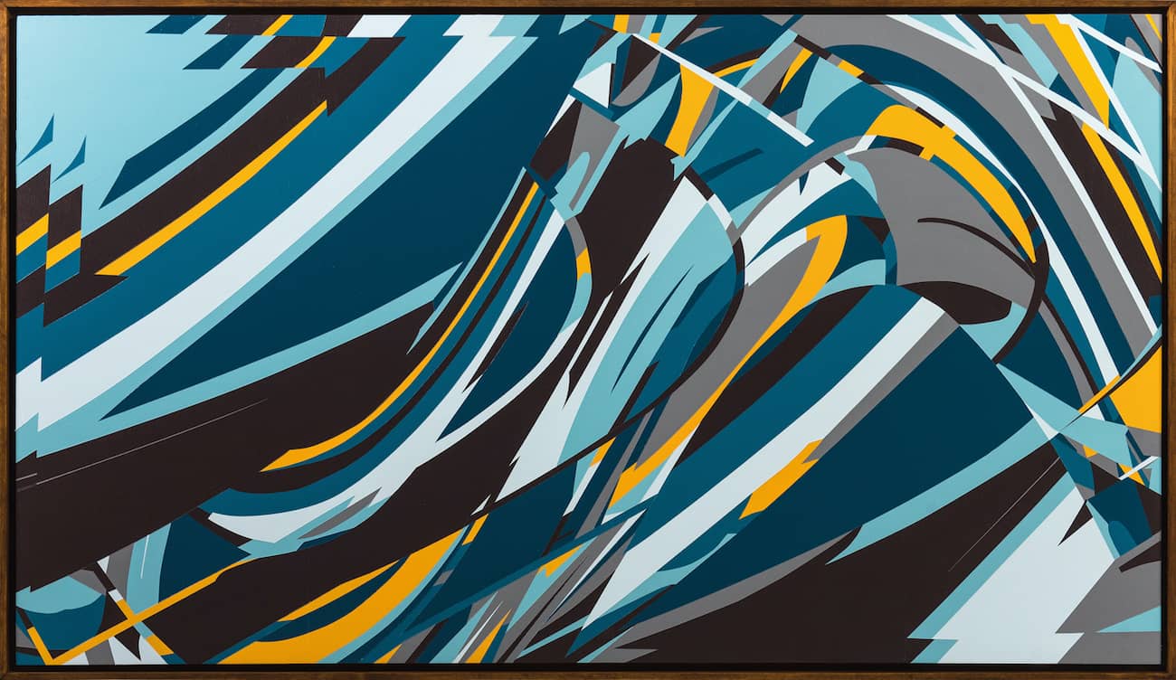
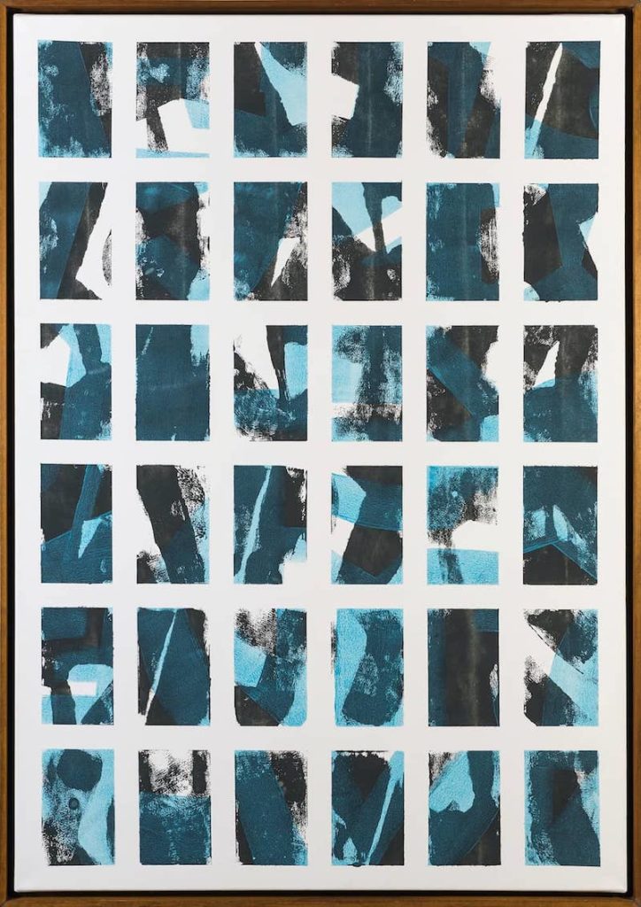
My works are purely abstract. The forms are freely invented and do not lean on the representational. It is a game with directions, energies, feelings, and harmony. Also the mathematical elements, like repetitions and using the same and broken forms, determine the visual language. Repetition is a theme that has occupied me very much in recent times. Repetition gives security and suggests routine but can also be stagnant by always remaining on the same spot. This contrast attracts me and keeps me busy. In my work, there are certain forms that are repeated, but because they are freely drawn by hand, they are always different. It’s often not about the individual form, which can stand on its own, but about the whole composition. It’s a bit like a composer who writes a piece by placing the individual notes precisely and deliberately together to form a melody. Precise planning with a touch of coincidence is a good recipe for my work.
The exciting thing for me is also that each viewer associates it with something different and thus deals with the work independently. Everyone recognizes their own figurative or abstract content in it. That’s great and gives free rein to the creativity of the viewer.
You use different tools to achieve an abstract graphic result and combine digital with haptic: working on the computer with working on the wall. What is your approach and working process? Does planning or spontaneity predominate?
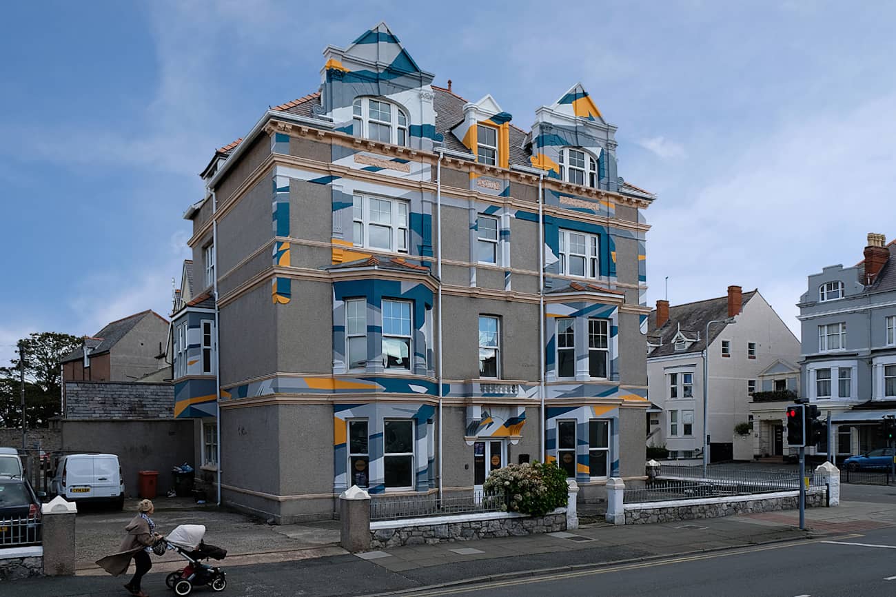
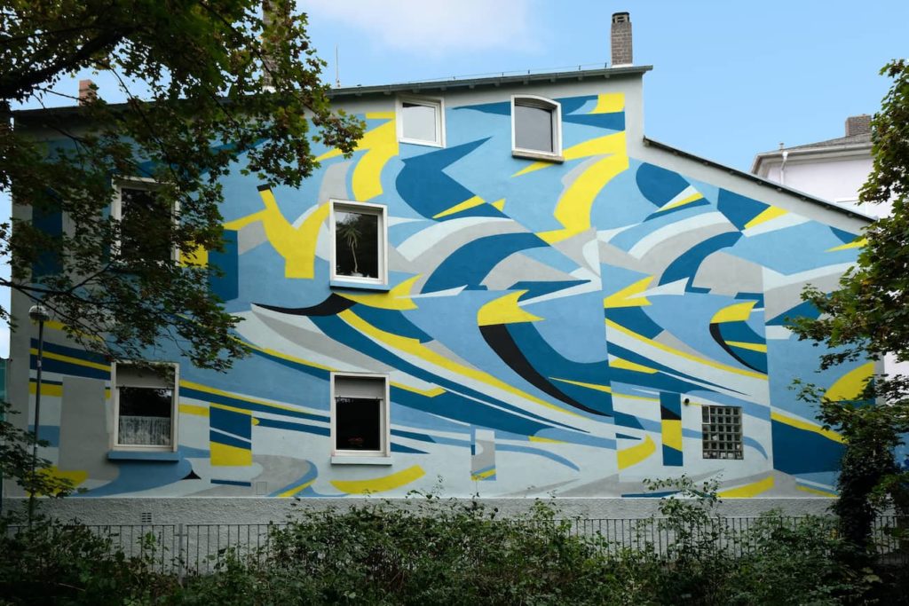
There is rather less spontaneity in the wall designs. Since the projects are also getting bigger, I have to be well prepared in advance. I usually look at the surroundings and the location beforehand.
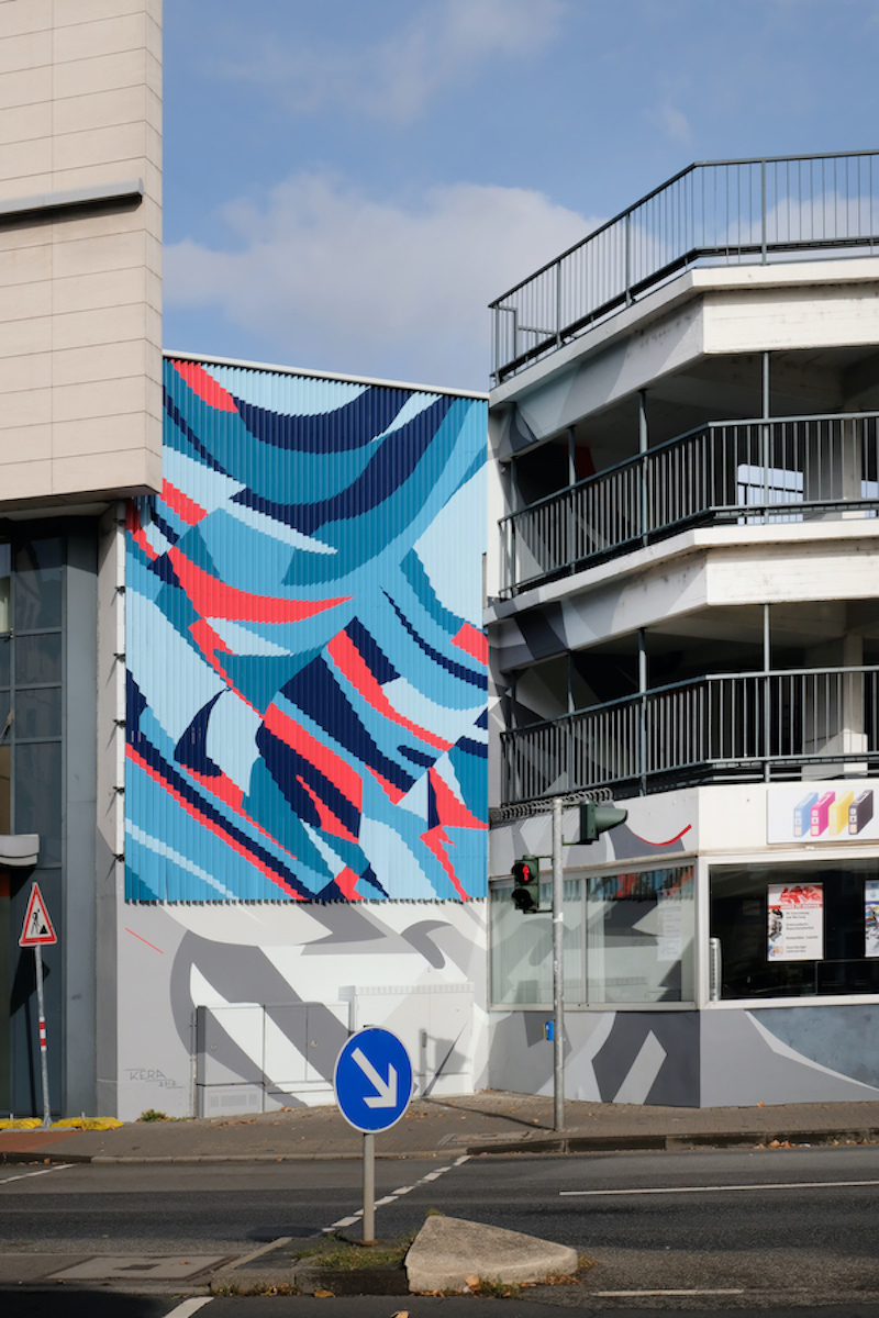
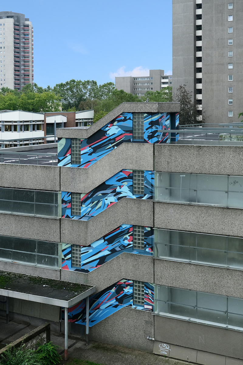
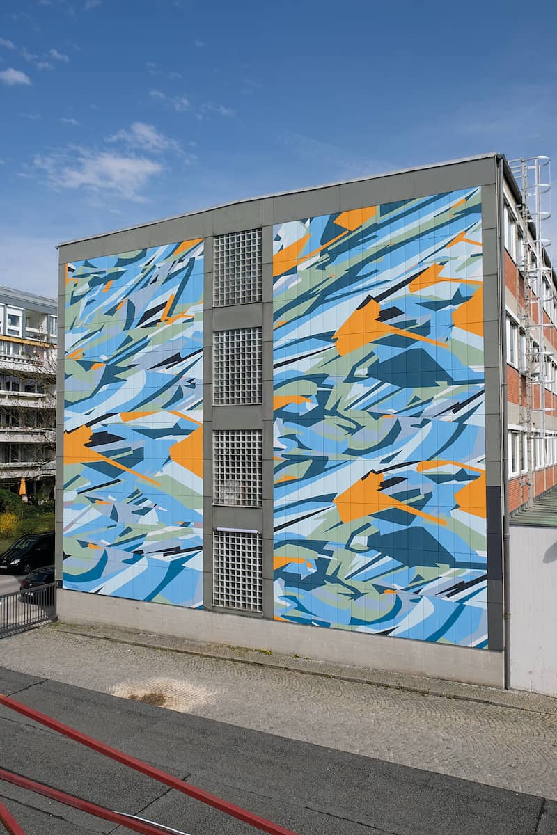
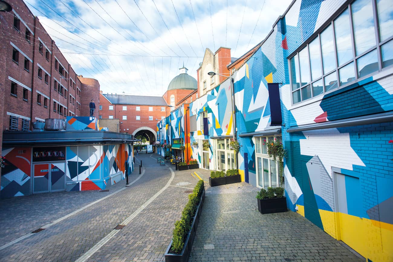
I try to get a feeling about whether the area to be played on is rather “loud” or instead needs a “quiet” approach. I look for colors that appear consciously and unconsciously in the environment and try to incorporate them harmoniously. I also use striking shapes from architecture in my graphics, even though I never copy them one-to-one, but include them in a modified way. I plan and create the work beforehand on the computer, which is also the creative part of the process. I develop shapes and graphics until I am satisfied with the result. Usually the process of designing goes on for several days until there is a feeling that tells me that it is ready. The implementation is then the part I enjoy the most, even though the creative process is almost complete. Of course, there are colors and shapes that change directly on the wall because they fit in better for me. So it doesn’t have to be implemented exactly like in the design.
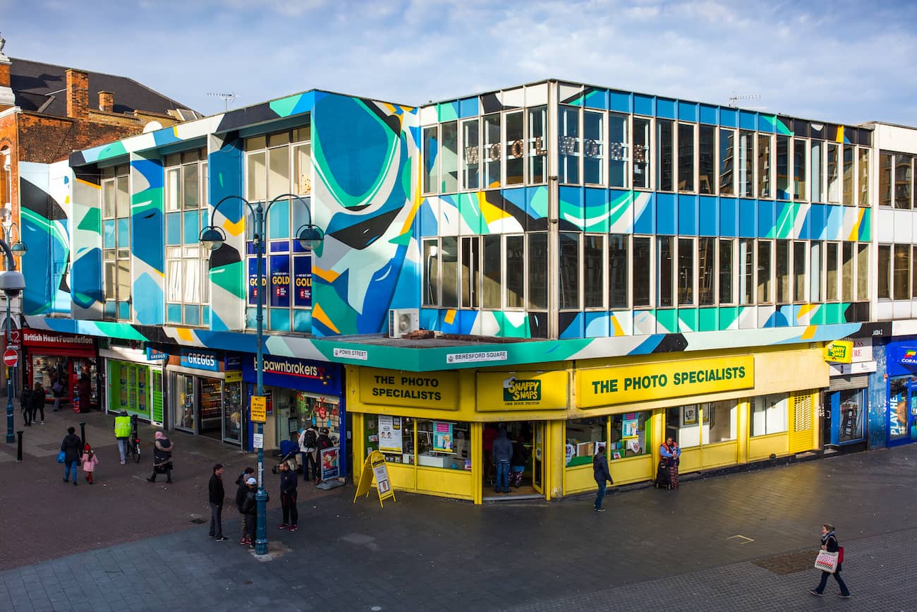
Your outdoor works blend fluidly into their environment in form and design, because you take into account and pick up on the color world of the surroundings and architecture. Your reduced color palette has become your distinguishing feature. How do you approach the color composition? Are the color tones also meticulously planned digitally in advance?
Over the years, I have quite unconsciously built up this color palette, behind which I still stand. In the wall works, I often try to let the colors from the environment flow in, so that my work fits harmoniously with the architecture. Sometimes I try to do the opposite and use complementary colors on purpose to make the wall seem louder and more exciting. But I do that rather rarely.
The decision to reduce the number of colors also came from letterpress and flat printing, where you need a screen or board for a color, and it is more complicated to handle the more colors that are used. So I try to express everything I feel with few colors.
The color tones are selected and planned in advance with the help of color guides. I have no fixed shades that I always use, and yet I am always surprised how similar the colors are in different projects. That is probably the unconscious instinct in the color selection. But, if the colors on the wall do not work as intended, I even mix the hue sometimes.
Besides the influences from graphics and print, what are your sources of inspiration; what drives you? Are there other (urban) artists that inspire you?
What drives me are the projects outside. Creating something with my hands and being physically active. The exchange and influences of different cities, countries and also cultures. Getting to know different people and their way of life. All these energies and color worlds I let flow into my work. Artists who inspire me are, among others, Carmen Herrera, Katharina Grosse, Frank Stella, and many more who go beyond the medium of painting.
Are there any differences (in terms of content, design, method) between the works on paper, wood, or canvas that you create in the studio and your works in public space?
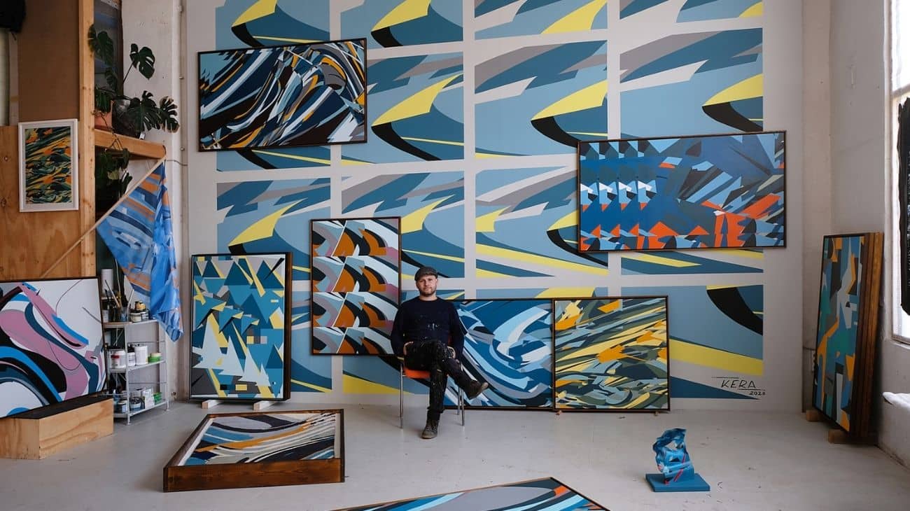
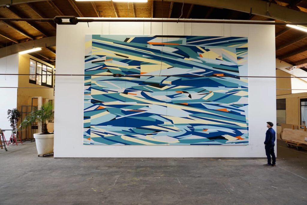
My works on wood or canvas are, so to speak, the compressed works of those in public space. I approach the canvas the same way I do the façade. In terms of content, they have the same structure.
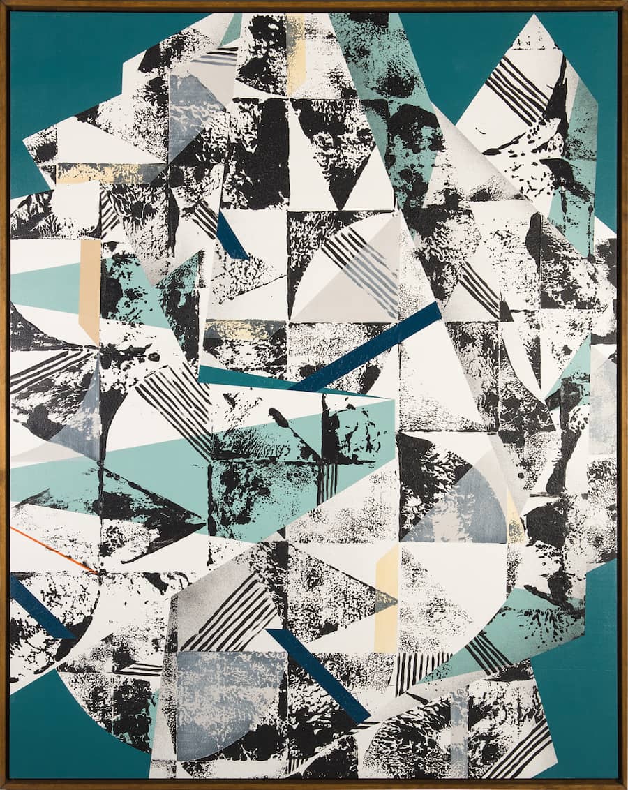
Lately I have painted more on wooden panels, which on the one hand are heavier in weight but also more robust. I can cut the tape directly on the wooden panel and the elevations of the color edges come out better on the wood than on the canvas. This also creates a haptic sense that you can even see. In the studio works I try to go more into the object-like. That means I experiment a lot with different materials to create the work as a dynamic, three-dimensional hanging object. For example, I have painted some works on hand-bent acrylic. From the front it looks flat but on closer inspection you notice that the sheet is distorted and bent. This creates a whole new play of light and shadow on the work, which opens up a new level. That’s also an influence from architecture.
In a second variation, I work a lot with monotypes, which means I work with prints. I can determine the exact form in advance, but I don’t know exactly what the print will look like beforehand. I play, so to speak, with the planned and the coincidence whereby each impression looks different. These are, for me, then, rather more spontaneous works, where I cannot determine everything in advance. In these works it is also more about the structures and the printing technique than about the clean, composed form.
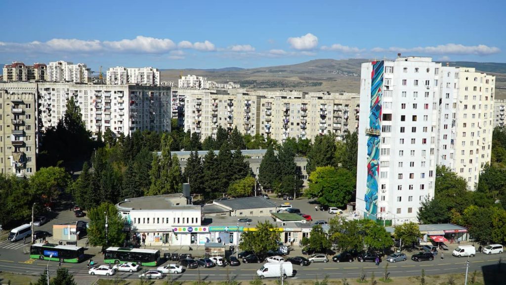
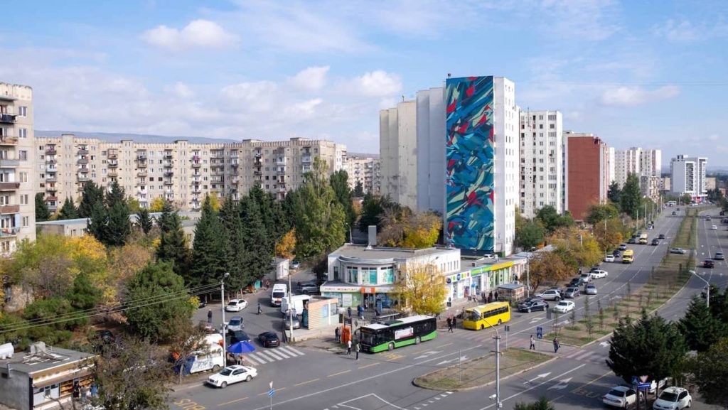
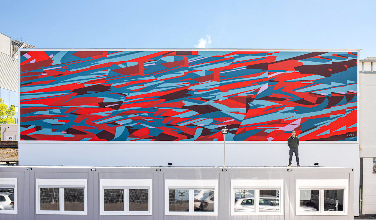
You’ve already designed well over 100 walls worldwide, whether as part of festivals, privately initiated, or commissioned work, and you say yourself “the area to be produced can’t be big enough.” Is it the increased level of difficulty that appeals to you, or does artistic freedom and the fun factor increase with size?
The phrase “the area to be produced can’t be big enough” is meant with a twinkle in the eye but also has a lot of truth to it. Of course, the larger the area to be covered, the larger the project and the more there is to organize. I love to think about and plan every detail as already described. I have artistic freedom with almost every project. Of course, I sometimes adapt to specifications with the color world, but how the shapes and graphics are placed together is always free and non-negotiable. I usually have very precise ideas.
The fun factor increases with the “difficulty” of the surface to be played, you could say, because then I start to merge the graphics with the architecture on one level. It goes far beyond just painting, which is also what makes the projects so exciting for me.
Also, each project is different. Of course, I can build on experience, but I am always faced with new tasks, which excites me very much. This not only challenges me as a painter but also gives me new energy and experience that I can incorporate into the next project.
What’s coming up for you? Any plans, projects, or dreams for this year (or as soon as coronavirus allows)?
Due to the coronavirus situation, it has of course become more difficult to plan projects, because the situation is always changing and projects and exhibitions are always being postponed. That’s why I was also very happy about the invitation to the STADT.WAND.KUNST festival in Mannheim, which I’ve been following for quite some time and which I was able to attend in April. Next, I will go to Georgia for a floor painting of a basketball court, which I am already very excited about.
For my further development I would like to connect more with architecture and to paint on different or new surfaces. That is, to design walls that go beyond mural painting, for example, and go over several levels or materials. I would like to play on new unconventional surfaces such as floors, ceilings, stairs, or stucco with the painting and perhaps even to incorporate sculptural forms.
KERA I Christian Hinz
Berlin, Germany
Website kera1.de
Instagram kera.1
Facebook kera1.kera1
Vimeo kera.1
_______________________________________
Pictures © KERA
May 2021
by Laura Vetter